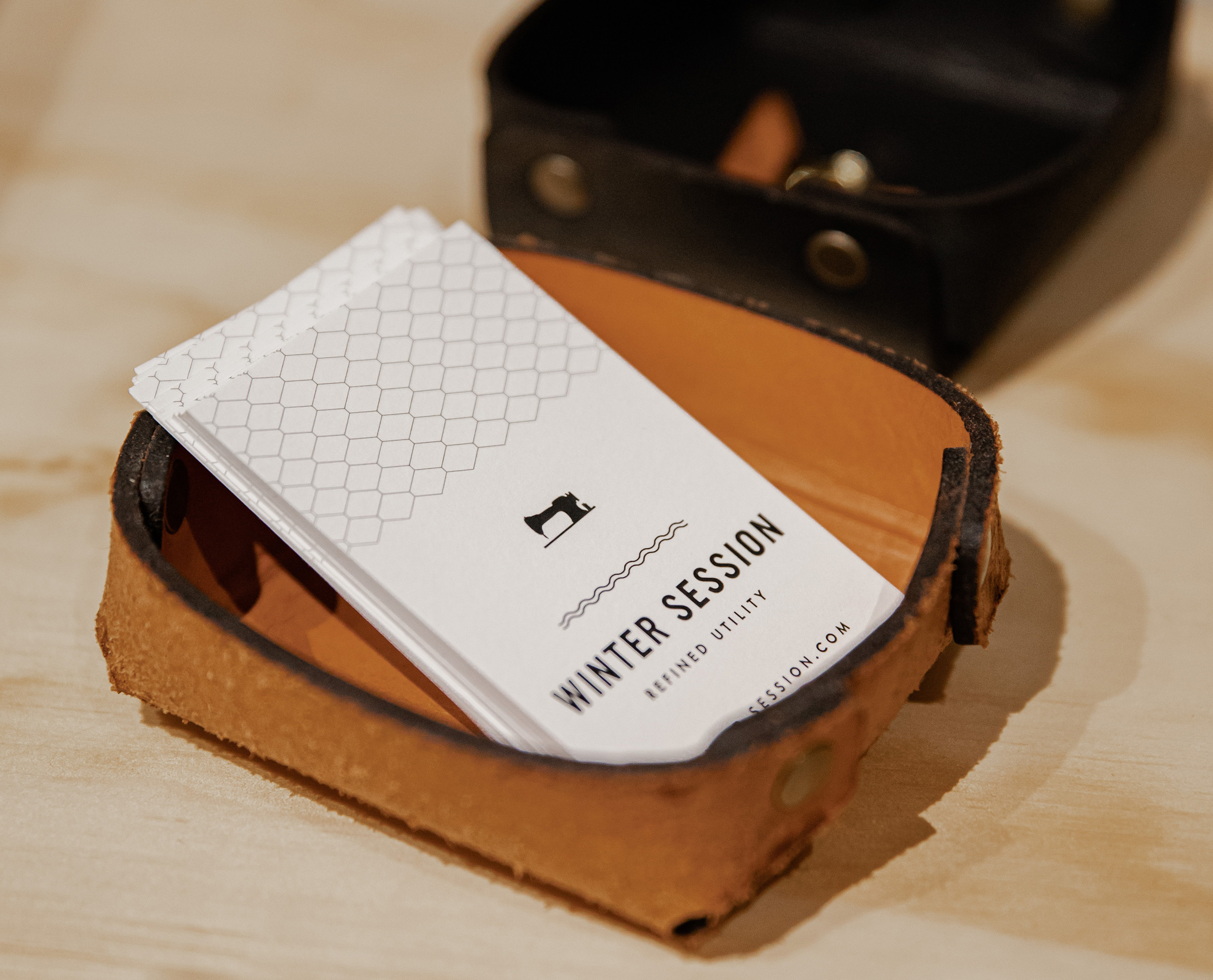
Despite most connections being formed digitally these days, business cards still have a place in the world. Whether it be after an initial meeting, networking or by-chance meetings, they allow you to leave a potential new contact with your details, as well as a physical connection, reminding them of who you are and what you do. It’s an easy way to make sure you’re remembered, as well as looking professional and prepared. Those rectangular, carefully cut slips of paper have great power to leave a first impression. The trick is to make sure it’s a good one.
Choose your information wisely
You’re given the size of a credit card to showcase who you are. Utilise the space well. Include all the necessary important information – your name, position, phone number and email. Consider how you want to be contacted. Just because your mate lists their home address, it doesn’t mean you need to as well. Also consider what information is useful – perhaps a brief sentence on what you offer. A simple map if you are a hard-to-locate location.
Keep it simple and precise
Convey the information clearly and concisely. For example, if you want to show that you’re all over your socials – instead of listing multiple handles, a simple logo of the platform does the job. Humans are lazy and choose the path of least resistance. In other words, people will type your business name into Google / Insta / TikTok etc and expect you to pop up. Rarely do we copy the info from business card to phone word for word.
There’s more to a business card than just the information printed on it. Choosing quality stock to print on is important and can make all the difference to a potential client. Paper weight is measured in GSM (Grams per square metre); a higher GSM value means a heavier, denser business card. Most business cards have a paper weight of 300gsm (fairly lightweight and cheaper) to 400gsm (sturdy, solid and more expensive). And don’t be limited to this – it’s possible to go thicker again if you want to, although we wouldn’t recommend going much lighter.
A Nicely done design
As a bunch of design-focused humans this comes all too naturally to us, but its definitely worth mentioning. Your business card is an extension of your brand, and so, is it on-brand? Are you using your brand colours and fonts? Is the design in-line with your brand image? Is the text legible? (Because nothing worse than calling a phone number and realising that too-tiny 3 is actually an 8). Have you proof-read at least 5 times? Spelling mistakes are a big no-no.
The perfect stock
Oh, and did we mention there are heaps of wonderful card stocks to print on too? Consider coated / uncoated / matte / Kraft / coloured / textured stocks. What does that stock say about you and your business? Every detail plays a part.
And the finishing touch…
There are heaps of ways to jazz up your business cards – foil, Spot UV, die-cut edges, letterpress, embossing… choosing the right finish is what can elevate your card from standard to something with a bit of pzazz. Before exploring ALL the options, think about is relevant to your business and what you want people to think when they receive your card. Avoid the trap of investing in a finish you think is cool but may not be the right image for your brand.
There’s a wee bit to consider but the humble business card really does have the potential to either turn away or bring in a new client, all because of the power of first impressions. Think about what business cards you’ve decided to hang onto over the years. What earns them a spot in your wallet or desk? Why did they made an impression on you? How can you ensure your business card isn’t another piece of clutter in someone’s day?
Business cards are small in size, but part of a bigger picture which forms your brand. Everything counts.
Photo by LOGAN WEAVER | @LGNWVR on Unsplash


